Insights | Article
Nostalgia is Brand Currency
Why heritage is a brand’s most valuable asset in uncertain times
By John Murinye

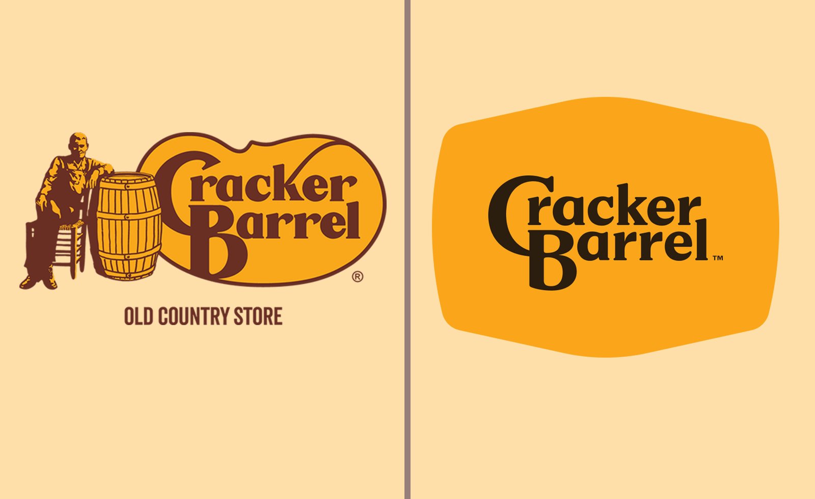
Cracker Barrel recently attempted a sweeping rebrand under new leadership, reported to cost $700 million. Interiors were refreshed, menus modernised, and stores redesigned — all sensible moves.
But the logo change was a bridge too far. By stripping away “Uncle Herschel,” Cracker Barrel erased decades of emotional equity.
Uncle Herschel was more than a mascot. He was the real-life uncle of founder Dan Evins — Herschel McCartney — who served as a kind of goodwill ambassador in the early days of the company. His stories of rural America inspired the chain’s nostalgic “country store” theme. For decades, his likeness — a kindly old man in a rocking chair — became shorthand for Southern hospitality, tradition, and rustic comfort.
Removing him didn’t just alter a logo; it felt like a disavowal of Cracker Barrel’s own identity. Customers weren’t just reacting to aesthetics — they felt betrayed. The symbol of authenticity and slower living they trusted had been discarded.
The irony? At the very moment global brands like Pepsi, Burger King, and Pizza Hut were leaning into heritage aesthetics, Cracker Barrel leaned out. It went against the cultural tide.
“Consumers crave authenticity and comfort in uncertain times.”
Why Nostalgia Works
Nostalgia provides both. It signals continuity, stability, and trust when everything else feels volatile. It’s why Pepsi resurrected the bold 80s wordmark. Why Burger King revived its 70s-inspired look. Why Pizza Hut leaned back into its red-roof iconography.
Nostalgia isn’t regression. Done right, it’s about carrying emotional anchors forward, while modernising the experience around them.
Lessons from Zimbabwe: The OK Zimbabwe Misstep
The same lesson applies at home. OK Zimbabwe, once a beloved retail giant, has struggled with its brand refreshes.
Two changes in particular stand out:
- Logo Modernisation: The old logo was distinct and memorable — instantly recognisable across generations. Yes, it had flaws: at small scale it lost legibility, and the “K” could easily be mistaken for an “H.” But it carried a unique core identity. In pursuit of minimalism, the new version stripped away that distinctiveness, flattening OK’s personality into something more generic.
- Slogan Shift: Moving from “Great savings. More smiles” to “My Happy Place” seemed like an attempt at aspirational branding, but it missed the mark. Where the old line emphasised value and reliability — the very reasons families trusted OK — the new one felt detached from reality, especially in a country where everyday economic pressures dominate.
In short, OK traded a position of trust and familiarity for one of generic aspiration. The result? A dilution of emotional connection, precisely when Zimbabwean consumers, facing uncertainty, most needed stability and authenticity.
The ENL Case Study: Heritage + Modernity
At Zarura, we explored this tension in our Eat n’ Lick editorial case study. ENL was suffering from irrelevance, squeezed between value players and aspirational global giants.
The solution wasn’t to abandon its identity, but to rebuild it with clarity: from transactions to tribe.
- We restored readability and ownership to the logo — not by erasing, but by refining.
- We rooted the strategy in cultural relevance, making ENL a pop culture brand.
- And crucially, we treated nostalgia not as a burden but as an asset to remix, modernise, and carry forward.
This balance of heritage and reinvention is what unlocks brand velocity — the ability to adapt at the speed of culture without losing your soul.
The Takeaway
Rebrands fail when they erase what people love. They succeed when they honour nostalgia as a brand asset while refreshing experience for new contexts.
Cracker Barrel’s stumble shows how erasing a living symbol of Southern hospitality can feel like betrayal. OK Zimbabwe’s drift shows how diluting heritage for generic aspiration weakens trust. And Eat n’ Lick shows how modernisation and nostalgia can coexist as accelerants.
Discover how heritage, modernity, and cultural velocity can converge to reposition a brand for lasting relevance.
Your Brand Messaging
The need for your brand identity to communicate, both consistently and distinctly, is…
Can Symbols Unite Nations?
National symbols hold immense power. They represent shared history, values, and…
Don’t Sell Emotions.
Sell Emotions, Not Products. This is a drastically flawed philosophy — that will, in the…