OK Zimbabwe Logo — A Missed Opportunity
by John Murinye
One of the largest retailer groups in Zimbabwe soft launched a new logo for one of its properties: OK Stores. It was received with mixed reviews. Our goal in this article is to try and understand the thinking behind the logo design and brand messaging, as not much information has been given — hence the soft launch.
The new OK Zimbabwe logo is a missed opportunity to further establish brand recognition whilst continuing its enduring legacy. Here’s why.

What Is A Soft Launch?
A soft launch is when a business releases a product or service on a test basis. The primary reason is to gather insights and refine their offering. In the case of a logo design or redesign, the goal is to see how their audience responds and then decide whether to officially launch it or withdraw it altogether.
Before we review the new logo, let’s take a bird’s eye view on the entire brand — so to help us better understand the new logo’s thought process.
About OK Zimbabwe
OK Zimbabwe Limited owns major properties within their brand portfolio that include OK Stores, Bon Marche, OK Mart and the recently acquired, Food Lover’s Market. OK Zimbabwe operates about 68 retail outlets in Zimbabwe. This makes rebranding and the redesign — a big deal.
OK Zimbabwe is currently using a Hybrid brand architecture model. This is when a brand owns multiple, isolated brands, along with extended brands. For example, Bon Marche and Food Lovers are standalone brands. They have no clear visible association with the Master brand OK Zimbabwe. Whereas OK Stores and OK Mart are an extension of their parent brand OK. The immediate reason why they would do this is to preserve each brand’s reputation, integrity and equity.
Looking at the hybrid brand architecture;

OK Stores and OK Mart serve the low to middle income earners.
Bon Marche and Food Lover’s Market serve the up market segment.
This means OK Zimbabwe has an untapped middle market opportunity.
TM Pick n Pay, OK Stores’ main competitor, largely targets the middle-market — with recent efforts to attract the up market. It will be interesting to see how OK Stores responds to this.
The rebrand and redesign comes with the commitment to spend US$27 million for in-store refurbishments to improve customers’ shopping experience. We wonder whether this is a move by OK Zimbabwe to reposition OK stores closer to the middle-market segment. Or retain OK Stores targeting the low to mid-income earners, then reposition either Bon Marche or Food Lover’s Market for the mid-market segment. The latter is very unlikely, given how much brand equity has already been built for both Bon Marche and Food Lover’s market segments.
With all this in mind; audience, brand architecture and market position — we will now review the new OK Zimbabwe logo design.
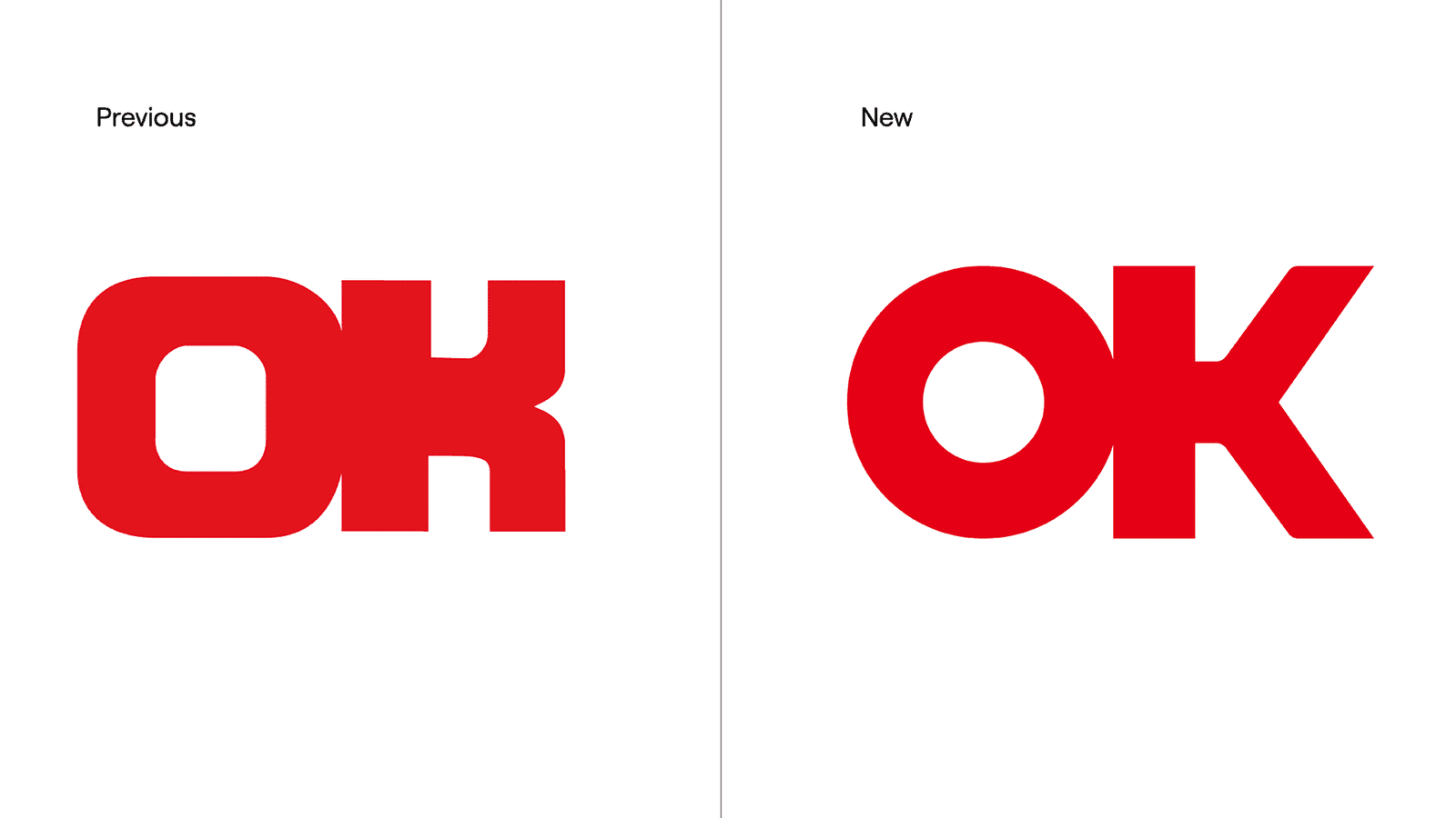
The Review

The previous logo had some significant strengths. It was simple, bold and blocky. It looks like a custom typeface inspired by what’s called a Slab Serif typeface. This gave the brand a visual dominance and authority.
OK Zimbabwe was first established in 1942. So this is a much-needed response to the changing landscape of brand design. The major pitfall of the previous logo was readability. It was hard to read clearly without a marketing campaign or message. The “K” read more as an “H”. The need for change is a great step in the right direction.

The new logo comes with a modern take. It’s based off a sans-serif typeface. The purpose may have been to make it more contemporary and much easier to read. They seem to have wanted to make the brand feel warmer and more approachable. Both have been somewhat achieved — however, it looses a lot of the visual equity the previous logo had. Apart from the colours and same letters, the nuances that made the previous logo distinct, are very much lost in this new attempt. It feels like an entirely new logo altogether.
The aspiration for the contemporary has made the logo identity very bland and generic.
The Solution
Below is our way to resolve this issue.
OK Stores has been in operation for over 80 years. Audiences have become so familiar with and deeply conditioned to the brand’s previous logo — it has been passed down over generations. It is one of Zimbabwe’s legacy brands. An evolution rather than a complete makeover would have been far more appropriate. A lot of equity was lost, and potentially — brand recognition would be at risk.


Instead, we propose a middle-ground approach between the previous and new. A logo mark that addresses the readability issues, whilst still paying homage to its legacy.