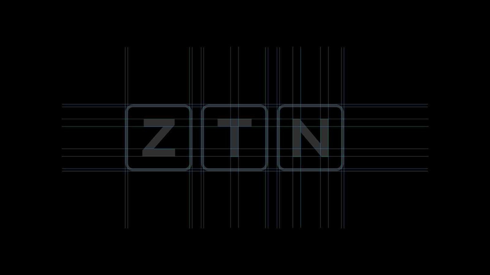
ZTN Zimbabwe Redesign
brand identity and visual language refresh that unifies Zimbabwe's media powerhouse
This is a concept project.
Zimpapers Television Network [ZTN Zimbabwe] is a leading online media arm of the Zimbabwe Newspapers Limited. In light of being awarded a free to air television licence, ZTN Zimbabwe requires a brand identity and visual language that unifies all sub-brands, increases brand recognition and further set it apart from its competition.

The Business Case
ZTN Zimbabwe needs a master identity that holds everything together and forms an integral part of a cohesive brand architecture. The current identity has some legibility issues, inconsistent letter forms and feels dated. The Global Brand Simplicity Index notes that up to US$98 Billion is being lost by brands that do not simplify their brand experience and communications.
A clear and consistent identity helps build loyalty and familiarity, which in turn reduces marketing costs over time.
In building the brand identity, I worked from the brand mantra: “A window to rich and diversified content.” This theme helped shape the visual language as it speaks to ZTN Zimbabwe’s portfolio of diverse content from local news, African art, fashion, film, business, sport and more.


you may also enjoy...
Rethinking Eat n’ Lick
We worked on the logo redesign, brand positioning and messaging concept for the Eat n' Lick brand.…
0 Comments4 Minutes
Brand Influence. Power.
For you to leverage your brand influence, you need to be a brand of integrity and character. The…
0 Comments2 Minutes
Can Symbols Unite Nations?
National symbols hold immense power. They represent shared history, values, and aspirations.
0 Comments3 Minutes