TelOne Zimbabwe
evolving TelOne Zimbabwe to communicate history and confidence
TelOne is Zimbabwe's first Telecoms. Along with strategic partnerships and an expanding footprint — this redesign hopes to recapture the hearts of Zimbabweans, communicate history and confidence — whilst being relevant, more visually accessible and modern. This is a brand refresh proposal.
The Business Case
TelOne Zimbabwe has innovated and taken noted leaps to improve service and gain market share. Remarkable as it may be, branding is more than function. Branding gives people a reason to believe. Beyond the technical, features and woo-ha. People engage brands emotionally first — then rationally to substantiate their emotional stance.
Why should Zimbabwe care about TelOne? This is what we will explore in this case study.
TelOne Zimbabwe is a brand that grew with the nation. It’s within Zimbabwe’s DNA. It’s the backbone and power behind many ‘Firsts’, amongst which…
the First telecoms
the First ICT assembly plant
the First data sharing service
After, you can read about When You Should Rebrand.
The Current Identity
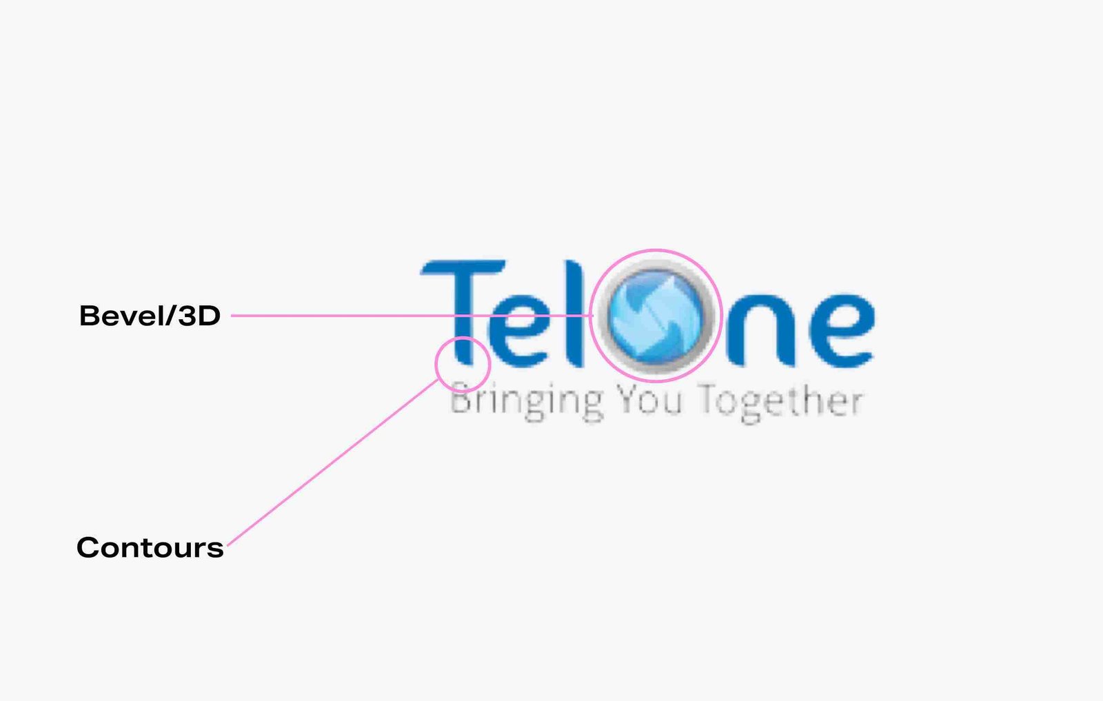
The tag-line is endearing. But the wordmark — saps it of its draw. Both wordmark and tag-line should complement and support each other to realize the emotion that is intended. In addition, the current wordmark poses a few challenges. The bevel/3D effect is dated, adds visual complexity and is restrictive for multiple platform use. The contours take from the identity’s strength – making it feel too curvaceous.
Our goals are to; create visual strength, visual balance, modernize and increase legibility.
The first stage is to flatten the icon and refine the wordmark.
Though it dramatically improves the identity, giving it more visual balance and stability. We can improve it further by reducing the colours. Making it even more immediate.
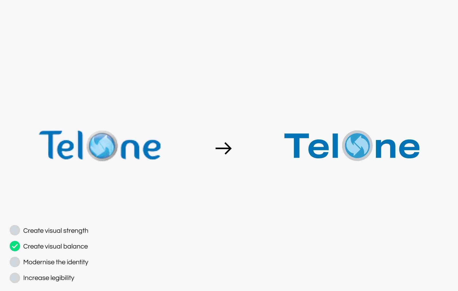
Next we remove the grey so we are left with a two-tone version of the logo.
This does indeed give us more immediacy and improved legibility. We can now read the identity as one unit.
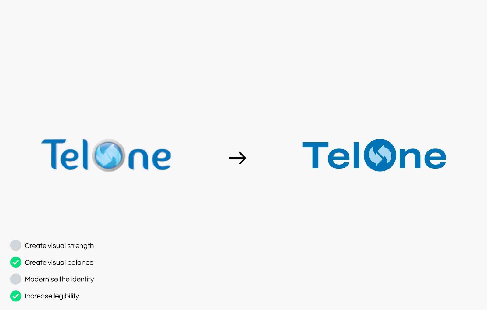
Finally, we change the colour of the arrows within the icon so they stand out more.
There certainly is greater visual strength in comparison to the current. However, looking at it now, we find that the identity can be easily misunderstood for a recycling company.

The Opportunity
TelOne Zimbabwe requires a single unifying visual motif that would also be the framework for all sub-brands. This will help create a cohesive and unified identity, which helps with recall and further builds trust.
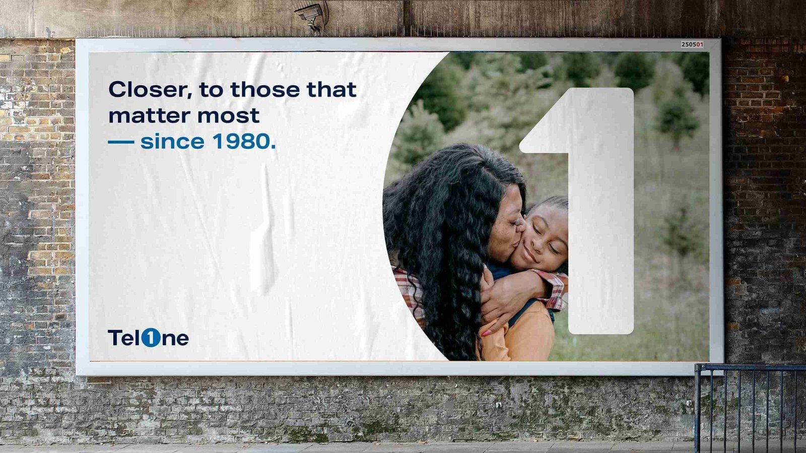
We want to help Zimbabweans see TelOne Zimbabwe not only as the backbone of the nation’s technology, but as a trusted partner for their everyday communications. The TelOne Zimbabwe brand evolution also seeks to appeal to the younger audience, with a youthful and energetic quality of the value proposition.
The Construct
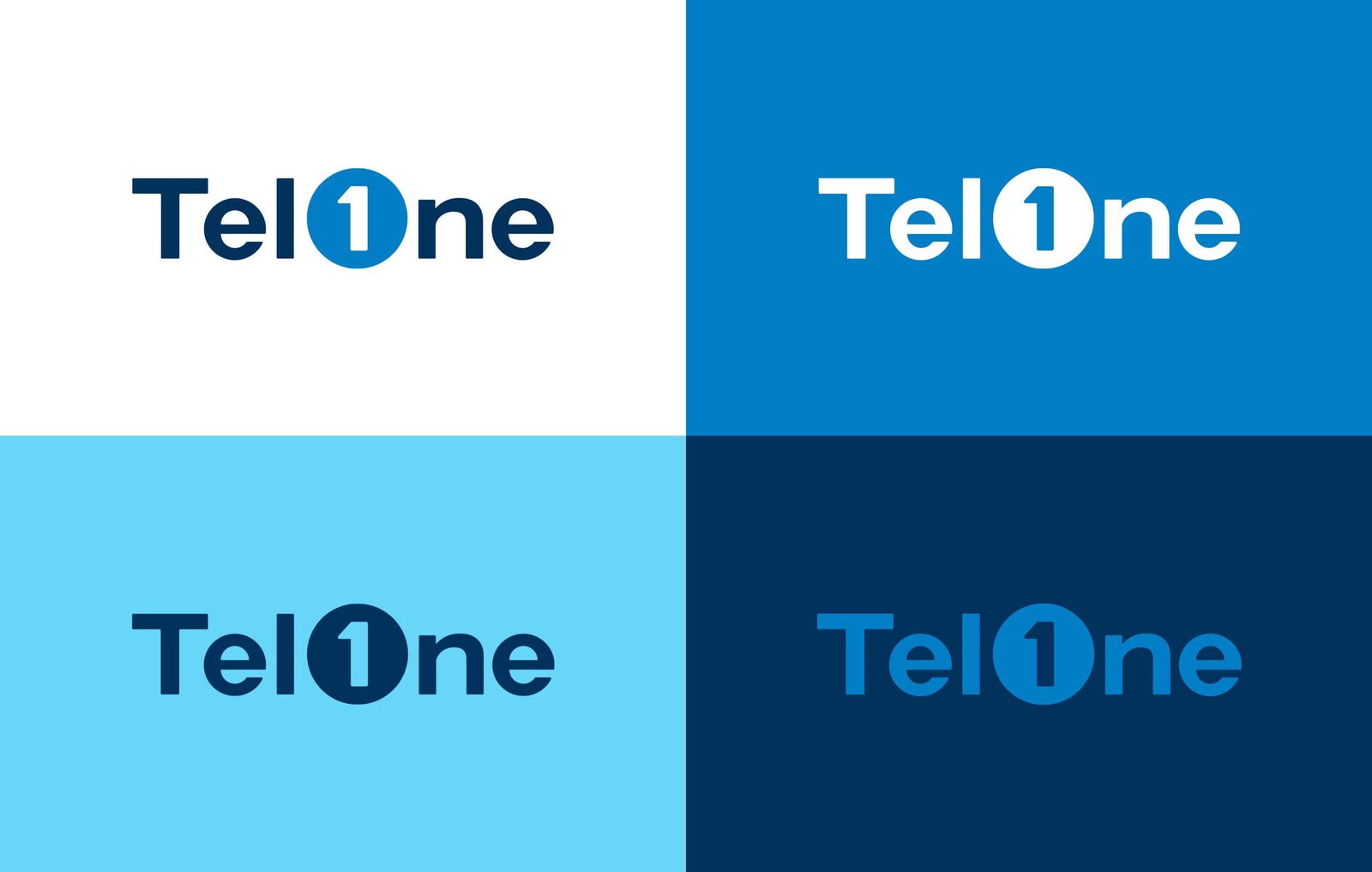
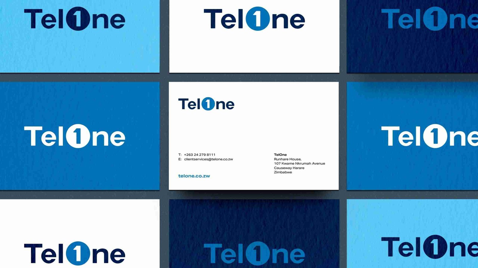
In continuance with the positioning of TelOne Zimbabwe as the pioneer and leading voice, we found an opportunity to create a monogram of the O and number 1. Creating a more recognizable and immediate mark. Embedding the number one in the blue circle, also provides a smoother transition between old and new.

The Refinements
Though the concept works well. We realized that the identity was lacking distinction. To be able to use the monogram in isolation, it needed some distinction whilst remaining simple. Looking further into TelOne’s history, we noticed that the brand is 42 years old. This was valuable detail that we used in crafting the angles and radius.


Good Design Is Honest.
At the heart of brand design is communication. The best brand identities, or logos, are simple enough to communicate clearly and distinct enough to be memorable. Often times the road to simplicity is complex. But its end — a somewhat “Aha” moment. When your audience remarks, “that makes sense.” Or, “that’s obvious.” You know you have developed something special that becomes the foundation for meaningful and lasting relationships.
When evolving a brand identity, one has to take into account the years of exposure its audience has been conditioned to. Exuberance is often counterintuitive. Empathy breeds lasting joy.
Yes, we want our audience to be excited about our evolution and journey. But no, we don’t want to lose them in trivial and somewhat, pretentious experiences that last but a moment — and quickly become redundant.

you may also enjoy...
Minority. People Branding.
The use of the word minority conjures up images and an understanding of being insignificant or…
0 Comments3 Minutes
Business vs Brand
In this article we are going to discuss and explain the essential difference between a Business,…
0 Comments5 Minutes
OK Logo — A Missed Opportunity
One of the largest retailer groups in Zimbabwe soft launched a new logo for one of its properties:…
0 Comments6 Minutes