Fine Urban Interiors
breathing new life into Fine Urban Interiors, a leading Kenyan design firm
This is a concept project.
Fine Urban Interiors is an owner-led, residential and commercial Interior Design and Consultancy firm, based in Nairobi, Kenya. It was founded in 2012 by Cleophas Manyinsa Nyagaka and is now a leading force working across homes, hotels, commercial buildings, boutiques clubs, restaurants, salons and barber shops, spa’s, hospitals and schools.
The Business Case
Fine Urban Interiors pays incredible attention to detail in all their interior design works. Currently, there is a clear disconnect between its design work and brand identity. The lack of visual cohesion leads to lower brand recognition and, ultimately, brand recall.
When approaching the redesign, I wanted to continue the same ethos of detail orientation, functionalism and modernity. The current identity has a very specific use case. That is, it only functions well in certain, constrained circumstances, e.g wide container, black backgrounds, etc.
The evolution frees the logo from those constraints, helping the identity function in multiple and almost any use case.
The Current Identity
The current Fine Urban Interiors identity is trying to emulate luxury and allude to the industry. It’s a reasonable attempt. It does create some immediacy along with the brand name. The issue is it’s dated. In a digital world, where most of the most effective communications and interactions are online, the identity has to be flexible enough to accommodate the same.
In addition, there’s not enough distinction to set the brand apart.


As always, the first stage is to try to salvage as much of the brand as possible. Are there ways we can retain as much visual equity? Or should we consider exploring a fresh perspective.
In this case, the latter works best.
The current identity points too much toward homes. Fine Urban Interiors go beyond residential. They cater to commercial buildings, hospitals and schools. Also, they offer remodelling services. With such an expanse, the identity has to take on a somewhat abstract approach. It’s about distinction, not being literal.


Through sketching, we are trying to find a visual direction that best speaks to Fine Urban Interiors elegance whilst being easily recognizable.
We also introduce the “F”. So we can have a single unit identifier. This is important to improve recognition and aid with recall.
Fine Urban Interiors is a design firm. As with all design firms, the fine balance between personal interpretation and meeting the client’s vision is paramount. So is true with the visual identity. In many ways, it must be distinct to help the firm stand out. And equally, it must have a functional quality that helps it recede into the background where necessary.
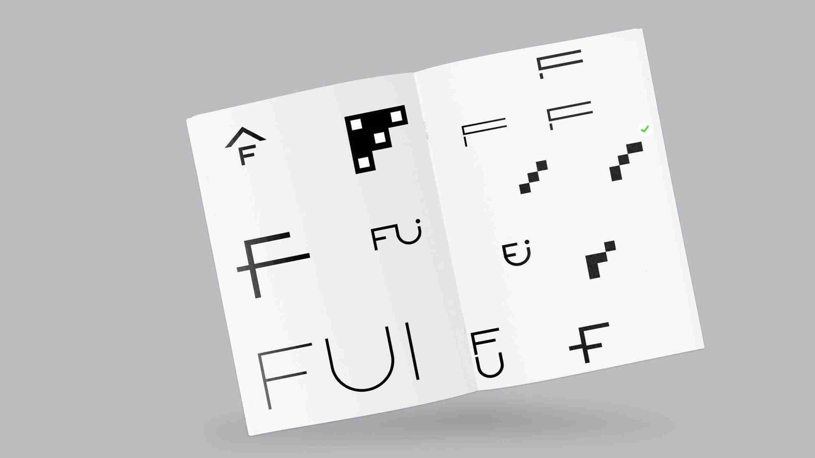

We’ve found a direction that we think works best. Again, there were several tests conducted to see if the identity is recognizable and legible at varying scales.
The final stage was to match the logo glyph with a fitting typeface.
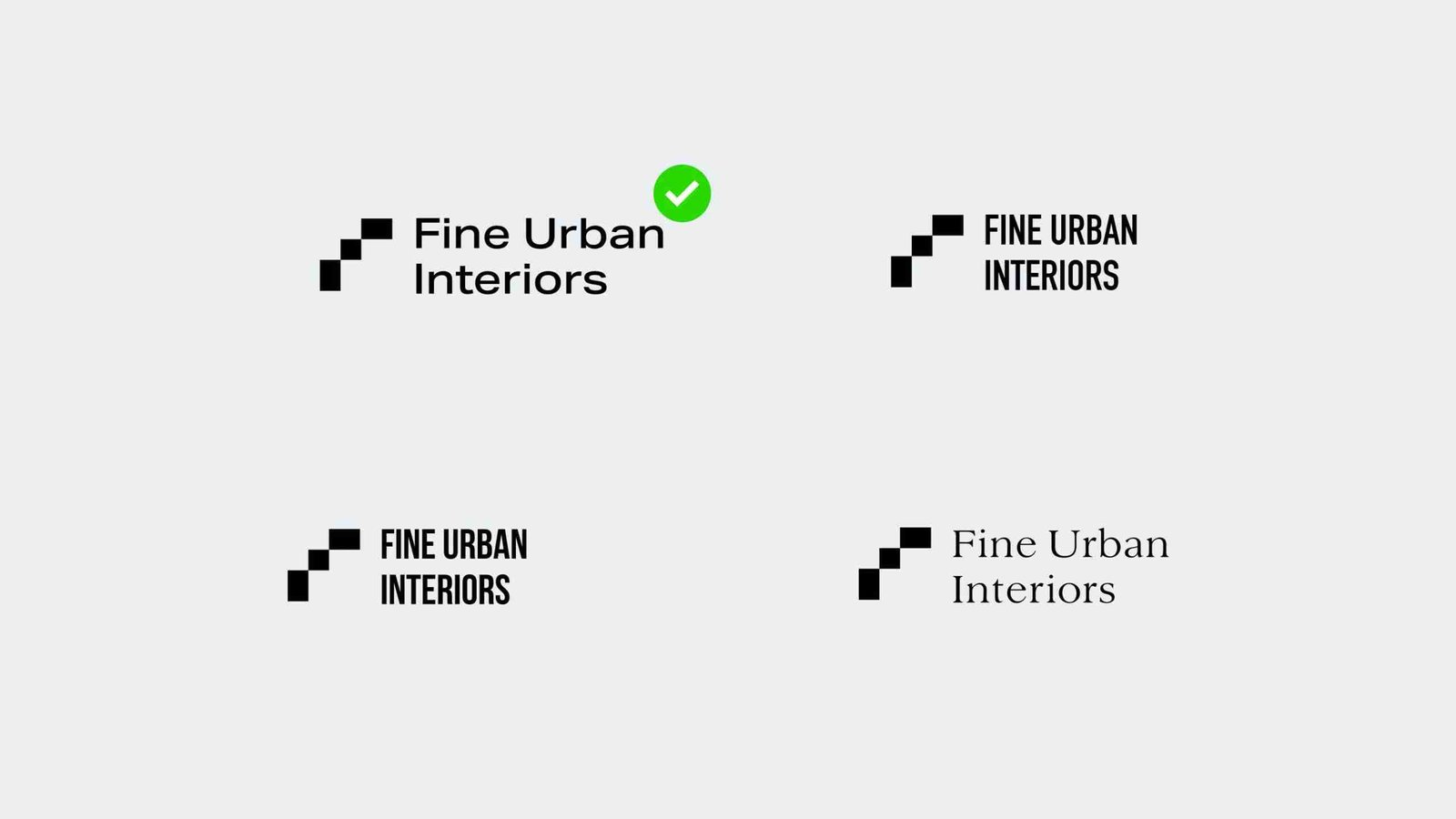

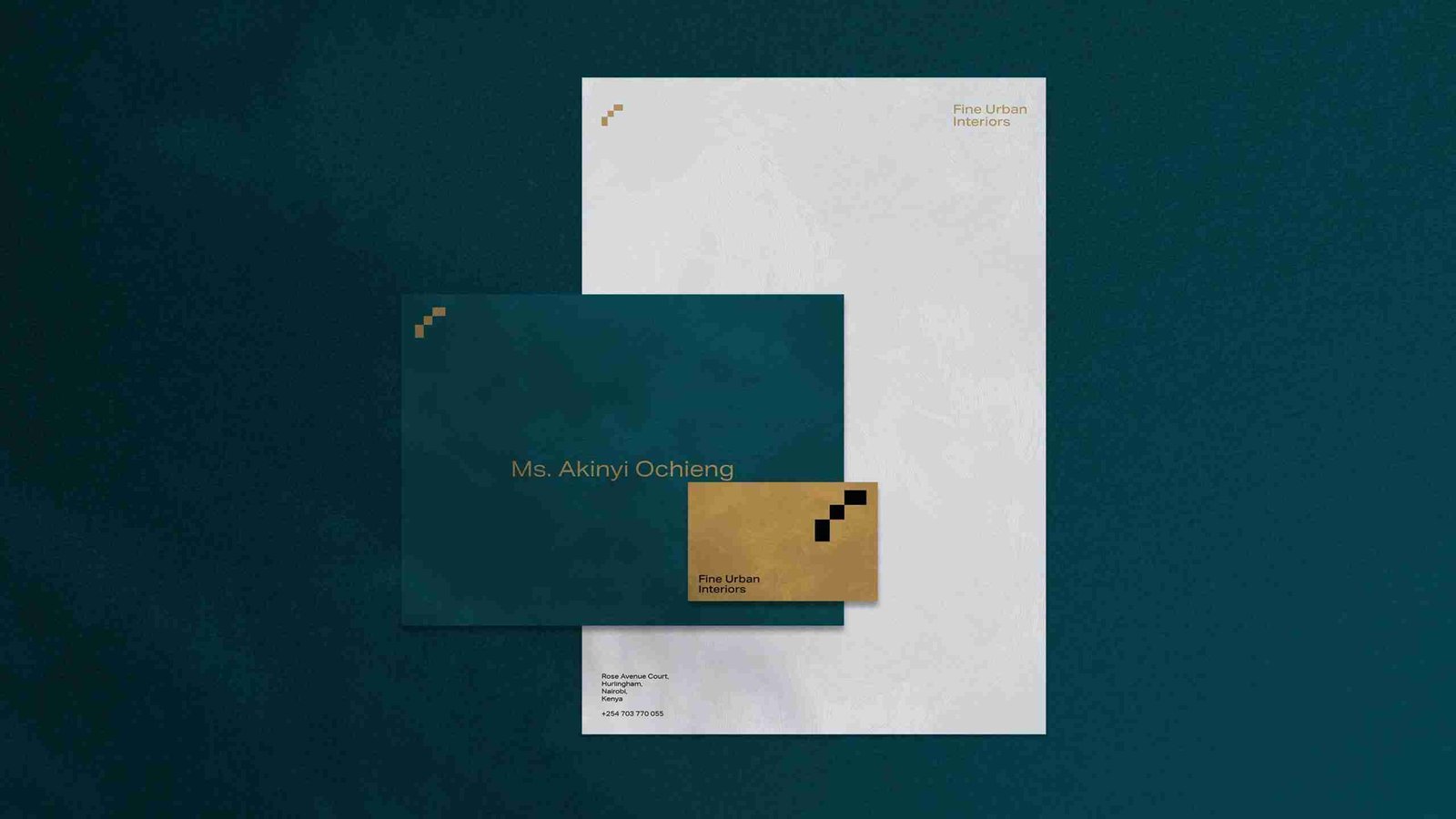
Lastly, we refine both the glyph and the wordmark. And introduce a refined color palette for Fine Urban Interiors.
See also how we improved TelOne Zimbabwe‘s brand identity.




you may also enjoy...
Your Brand Messaging
The need for your brand identity to communicate, both consistently and distinctly, is more crucial…
0 Comments2 Minutes
Why We Specialize
In the vibrant and ever-evolving business landscape of Zimbabwe, there are many one-stop shops. At…
0 Comments5 Minutes
OK Logo — A Missed Opportunity
One of the largest retailer groups in Zimbabwe soft launched a new logo for one of its properties:…
0 Comments6 Minutes